Stream Graph
Sebastian Hollizeck, Dawson Labs
2020-11-19
streamgraph.RmdLevel: Advanced
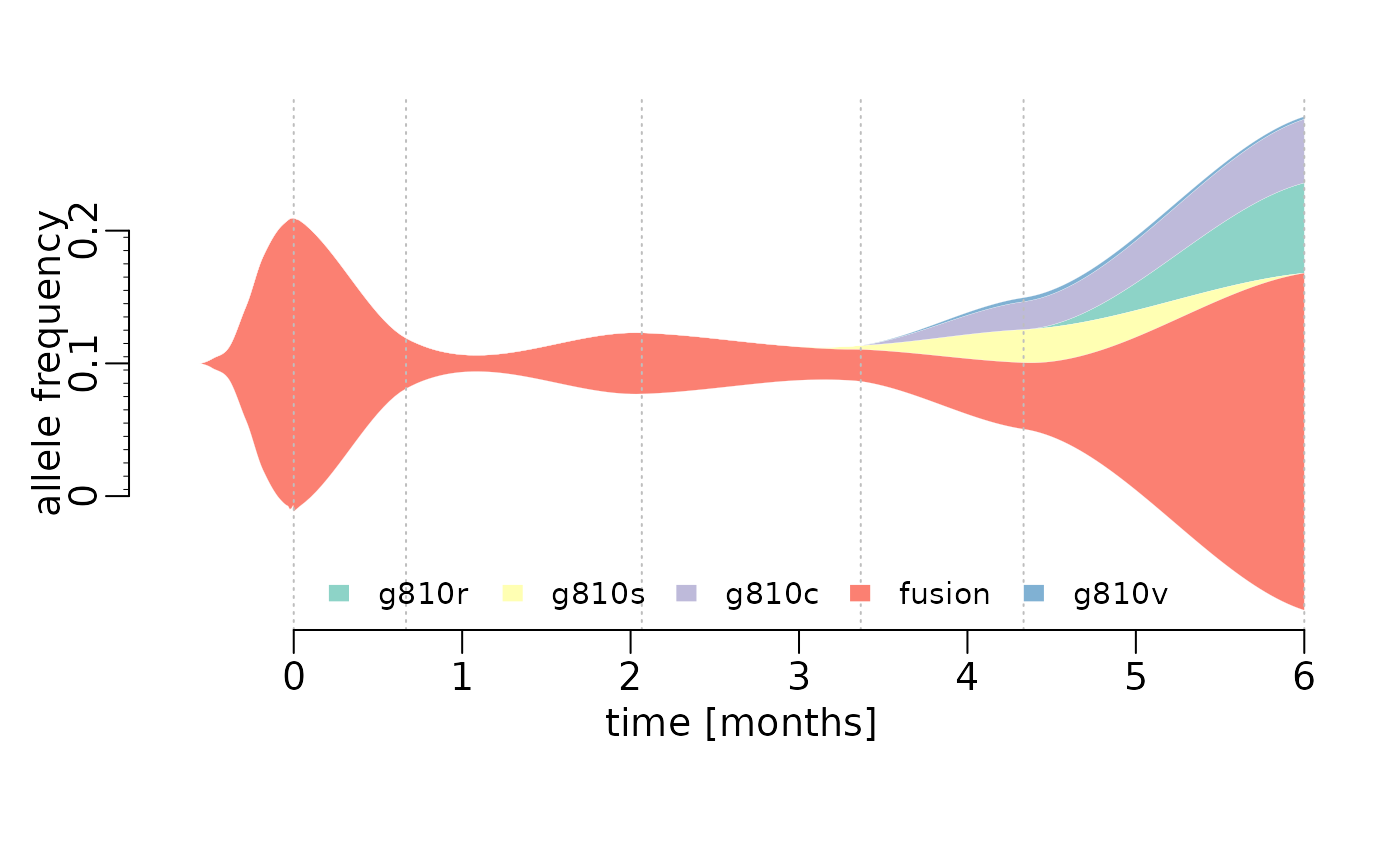
This shows how to create a stream graph using base R, such as the one in Figure 1B (Solomon et al. 2020). The graph shows the allele frequencies of a founder fusion mutation and G810 substitution mutations that emerged over time.
Example data
library(data.table)
dates <- as.Date(c("2018-3-9","2018-3-29","2018-5-10","2018-6-18","2018-7-17","2018-9-5"))
fusion <- data.frame(date=dates,vaf=c(22.1,3.8,4.6,2.4,5,25.4),var="fusion")
G810R <- data.frame(date=dates,vaf=c(0,0,0,0,0,6.8),var="G810R")
G810C <- data.frame(date=dates,vaf=c(0,0,0,0,2.1,4.8),var="G810C")
G810V <- data.frame(date=dates,vaf=c(0,0,0,0,0.3,0.2),var="G810V")
G810S <- data.frame(date=dates,vaf=c(0,0,0,0.3,2.5,0),var="G810S")

#lets make this one big data frame, so we have an easier time
y <- data.table(g810r=G810R$vaf,g810s=G810S$vaf,g810c=G810C$vaf,fusion=fusion$vaf,g810v=G810V$vaf,date=dates)
#take a look
head(y)
## g810r g810s g810c fusion g810v date
## 1: 0.0 0.0 0.0 22.1 0.0 2018-03-09
## 2: 0.0 0.0 0.0 3.8 0.0 2018-03-29
## 3: 0.0 0.0 0.0 4.6 0.0 2018-05-10
## 4: 0.0 0.3 0.0 2.4 0.0 2018-06-18
## 5: 0.0 2.5 2.1 5.0 0.3 2018-07-17
## 6: 6.8 0.0 4.8 25.4 0.2 2018-09-05Stream graph function
plotStreamGraph <- function(data=stop("No data, NO PLOT, also no cape!"), smoothed=TRUE, start=TRUE, dates="date", colors=NULL, span=0.6){

  require(data.table)
  data <- data.table(data)

  #lets check first, if there is a date column in there
  if (! dates %in% colnames(data)){
    #well this is a problem
    #maybe check if there is a date type column in there?
    date_columns <- which(lapply(data,class) == "Date")

    if(length(date_columns) == 0){
      #well without dates, we will have to assume the measurements are unidistant
      data$TotalDays <- as.integer(c(0:(nrow(data)-1))*30)

    }else{
      #we just take the first one and be happy
      dates <- names(date_columns[1])
      data$TotalDays <- as.integer(unlist(data[,..dates]-c(data[1,..dates])))
    }
  }else{
    # check if this is actually a date
    #TODO

    #and then convert this to actually usable x values by substracting the first value from all the others
    # TODO: sorting?
    #we set this as interger, so we can later exclude it easier
    data$TotalDays <- as.integer(unlist(data[,..dates]-c(data[1,..dates])))

  }

  #now that this is sorted we get to the good part

  if(smoothed){
    #fit a loess model with each column
    #but only keep numerical columns
    keep <- which(lapply(data,class)=="numeric")
    loess_list <- lapply(data[,..keep], function(x) loess(unlist(x)~data$TotalDays,span=span))

    #now we interpolate for all days between the the measurements
    interpSteps <- seq(from=data$TotalDays[1], to=data$TotalDays[nrow(data)])

    interpData <- data.frame(lapply(loess_list, function(x) predict(x, interpSteps)))

    #now negative occurances do not make sense with this
    interpData[interpData<0] <- 0

    plotData <- interpData
    plotX <- interpSteps

  }else{
    #if there is no smoothing, we just copy the raw data
    plotData <-data[,..keep]
    plotX <- data$TotalDays
  }
  # now we also need and X value for each point

  if(start){

    if(smoothed){
      #now this is a bit of a hassle
      #first we create a general outline of the way the thing should run
      # we basically simulate a decay function
      startValues <- data.frame(matrix(c(rep(0,ncol(plotData)), # 0 is the endpoint
                                         plotData[1,]/91,
                                         plotData[1,]/27,
                                         plotData[1,]/9,
                                         plotData[1,]/3,
                                         plotData[1,]*0.8,
                                         plotData[1,]*0.9,
                                         plotData[1,]),
                                       byrow = TRUE, nrow=8)) #and we have 8 time points to consider

      #this is our backbone and now we smooth this,
      loess_list <- lapply(startValues, function(x) loess(unlist(x)~c(1:nrow(startValues))))

      #here we just interpolate a lot of points in between
      smooth_start <- as.data.frame(lapply(loess_list, function(x) predict(x,seq(from=1,to=nrow(startValues),by=0.1))))

      #find out the first time 0 appears and set everything to 0 afterwards
      smooth_start <- apply(smooth_start, 2, function(x) {
        x[c(1:max(which(x<=0)))] <- 0
        return(x)
      })

      #now we combine the start with the actual data
      colnames(smooth_start) <- colnames(plotData)

      #now you trim a bit of, so the breakpoint is not as obvious
      smooth_start <- head(smooth_start,n=-2)
      #and then average over the breakpoint

      breakIndex <- nrow(smooth_start)
      smooth_start[breakIndex-2,] <- colMeans(rbind(tail(smooth_start,3),plotData[c(1),]))
      smooth_start[breakIndex-1,] <- colMeans(rbind(tail(smooth_start,2),plotData[c(1,2),]))
      smooth_start[breakIndex,] <- colMeans(rbind(tail(smooth_start,1),plotData[c(1,2,3),]))

      #now we combine that into one
      plotData <- rbind(smooth_start, plotData)

      #and obviously add some more xValues that need to be plotted
      startX <- rev(seq(from=-0.1,by=-0.3, length.out=nrow(smooth_start)))

      plotX <- c(startX, plotX)

    }else{
      #just connect everything with the 0 line

      zeroes <- rep(0,ncol(plotData))
      names(zeroes) <- colnames(plotData)
      plotData <- rbind(t( zeroes), plotData)
      plotX <- c(-15,plotX)
    }

  }else{
    #no start means no work :)
  }


  # now for the plotting

  if(is.null(colors)){
    require(RColorBrewer)
    colors <- RColorBrewer::brewer.pal(ncol(plotData),"Set3")

  }

  plotData <- as.data.frame(plotData)

  #we change the margins a bit and move the axis to where we want.
  oldpar <- par(c("mar","mgp","cex"))
  par(mar=c(5.1,2.9,2.1,1.1),mgp=c(1.4,0.5,0),cex=1.2)

  #then we plot the data.
  .plot.stream(plotX, plotData, axes=FALSE, xlim=c(min(plotX), max(plotX)), center=TRUE,  spar=0, frac.rand=0, col=colors, border="white", lwd=0.1, xlab="", ylab="allele frequency")
  title(xlab="time [months]", mgp=c(1.5,1,0))

  #add in the horizontal lines to show when the real data was taken
  for(pos in data$TotalDays){
    abline(v=pos, lty=3, col="grey")
  }

  # this is the y axis, but in ruler style with small ticks
  axis(2,at=c(-10,0,10), labels= c(0,0.1,0.2), line=0.1)
  rug(x = -10:9 + 0.5, ticksize = -0.01, side = 2, line=0.1)

  #now this is the xaxis
  axis(1,at=seq(from=0,to=data$TotalDays[nrow(data)],by=30),labels=seq(from=0,to=data$TotalDays[nrow(data)]/30))

  #and of course we add a legend
  legend("bottom", legend=colnames(plotData), fill=colors, border="white",bty="n", ncol=min(nrow(data),ncol(plotData)), cex= 0.8)
  par(oldpar)
}


.plot.stream <- function(
  x, y,
  order.method = "as.is", frac.rand=0.1, spar=0.2,
  center=TRUE,
  ylab="", xlab="",
  border = NULL, lwd=1,
  col=rainbow(length(y[1,])),
  ylim=NULL,
  ...
){

  if(sum(y < 0) > 0) error("y cannot contain negative numbers")

  if(is.null(border)) border <- par("fg")
  border <- as.vector(matrix(border, nrow=ncol(y), ncol=1))
  col <- as.vector(matrix(col, nrow=ncol(y), ncol=1))
  lwd <- as.vector(matrix(lwd, nrow=ncol(y), ncol=1))

  if(order.method == "max") {
    ord <- order(apply(y, 2, which.max))
    y <- y[, ord]
    col <- col[ord]
    border <- border[ord]
  }

  if(order.method == "first") {
    ord <- order(apply(y, 2, function(x) min(which(r>0))))
    y <- y[, ord]
    col <- col[ord]
    border <- border[ord]
  }

  bottom.old <- x*0
  top.old <- x*0
  polys <- vector(mode="list", ncol(y))
  for(i in seq(polys)){
    if(i %% 2 == 1){ #if odd
      top.new <- top.old + y[,i]
      polys[[i]] <- list(x=c(x, rev(x)), y=c(top.old, rev(top.new)))
      top.old <- top.new
    }
    if(i %% 2 == 0){ #if even
      bottom.new <- bottom.old - y[,i]
      polys[[i]] <- list(x=c(x, rev(x)), y=c(bottom.old, rev(bottom.new)))
      bottom.old <- bottom.new
    }
  }

  ylim.tmp <- range(sapply(polys, function(x) range(x$y, na.rm=TRUE)), na.rm=TRUE)
  outer.lims <- sapply(polys, function(r) rev(r$y[(length(r$y)/2+1):length(r$y)]))
  mid <- apply(outer.lims, 1, function(r) mean(c(max(r, na.rm=TRUE), min(r, na.rm=TRUE)), na.rm=TRUE))

  #center and wiggle
  if(center) {
    g0 <- -mid + runif(length(x), min=frac.rand*ylim.tmp[1], max=frac.rand*ylim.tmp[2])
  } else {
    g0 <- runif(length(x), min=frac.rand*ylim.tmp[1], max=frac.rand*ylim.tmp[2])
  }

  fit <- smooth.spline(g0 ~ x, spar=spar)

  for(i in seq(polys)){
    polys[[i]]$y <- polys[[i]]$y + c(fit$y, rev(fit$y))
  }

  if(is.null(ylim)) ylim <- range(sapply(polys, function(x) range(x$y, na.rm=TRUE)), na.rm=TRUE)
  plot(x,y[,1], ylab=ylab, xlab=xlab, ylim=ylim, t="n", ...)
  for(i in seq(polys)){
    polygon(polys[[i]], border=border[i], col=col[i], lwd=lwd[i])
  }

}References
Solomon, Benjamin J., Lavinia Tan, Jessica J. Lin, Stephen Q. Wong, Sebastian Hollizeck, Kevin Ebata, Brian B. Tuch, et al. 2020. “RET Solvent Front Mutations Mediate Acquired Resistance to Selective RET Inhibition in RET-Driven Malignancies.” Journal of Thoracic Oncology 15 (4): 541–49. https://doi.org/10.1016/j.jtho.2020.01.006.