Pie Chart
Sebastian Hollizeck, Dawson Labs
2020-11-19
piechart.RmdLevel: Intermediate
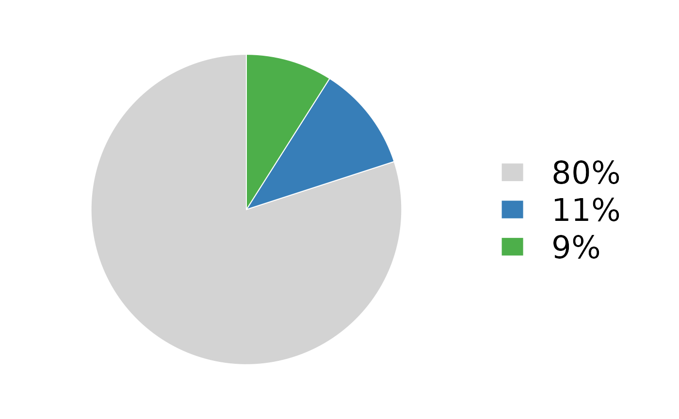
This shows how to create a pie chart using base R, such as the ones in Figure 1D (Solomon et al. 2020). The chart shows the allele frequencies of mutations in a tumour sample.
Set up the colouring
variantColors <- RColorBrewer::brewer.pal(4, "Set1")
names(variantColors) <- c("r", "c", "s", "v")
Plot one pie
par(mar = c(0, 0, 0, 10))
pie(c(0.80, 0.11, 0.09), col = c("lightgrey", variantColors[c("c", "s")]), border = "white", labels = "", init.angle = 90)
rng <- par("usr")
legend(rng[2] - 0.1, 0, yjust = 0.5, legend = c("80%", "11%", "9%"), fill = c("lightgrey", variantColors[c("c", "s")]), bty = "n", border = "white", cex = 2, xpd = TRUE)
References
Solomon, Benjamin J., Lavinia Tan, Jessica J. Lin, Stephen Q. Wong, Sebastian Hollizeck, Kevin Ebata, Brian B. Tuch, et al. 2020. “RET Solvent Front Mutations Mediate Acquired Resistance to Selective RET Inhibition in RET-Driven Malignancies.” Journal of Thoracic Oncology 15 (4): 541–49. https://doi.org/10.1016/j.jtho.2020.01.006.